Spoiler alert: Withstand the temptation to scroll down. ;-}
It's time to reveal the cover of The Heart Changer! I think the process involved in creating an image to suit a story will fascinate you. So, stick with me and be patient, okay? The Very First Cover Image
I was asked what I envisioned for my cover in Ambassador International's marketing questionnaire. I like that about my publisher. They want you to have as much input as possible to feel a part of the process. Since I have a Pinterest account, I gave them a link to a secret board with ideas pulled from other middle grade novels. Trouble is, I chose fantasy covers as well as historical fiction, because I loved the swirly themes -- almost Medieval-like. Looking back, they didn't fit The Heart Changer.
So, when Hannah Nichols, the creative director at Ambassador (who read my book before beginning her design), sent this first image around Thanksgiving, I had a strange reaction. Actually, almost no reaction, and I don't know why. It was a feeling of peace and contentment. But, as I studied the cover which, to this day, I love, I quickly surmised, although the woman on the cover was beautiful, it sadly was not my main character. Also, my first name was misspelled, and was not my nom de plume. I had chosen Jarm Del Boccio, for many reasons. And another thing, the story is set in the middle eastern country of Syria, which is largely desert. The best part of the first image was the title. I was mesmerized with the font and the gold to burgundy progression. 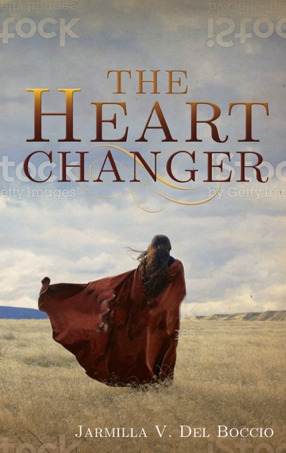
In quick succession, the next four images arrived in my inbox. This one below was better, but still not my MC, the title color too plain, and I missed the contrasting blue sky!
Then this image, which was my least favorite . . .
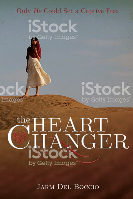
Nope. I didn't like her legs showing. And in Old Testament days, they would not have been allowed o show off their legs. On to the next image.
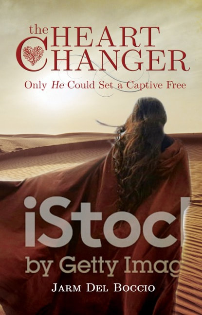
I had asked Hannah to try a sunset instead of blue sky. When I saw it, I didn't care for it at all. I had also asked her to place a flowery image of a heart in the title. I didn't like that either! And I missed the gorgeous title. 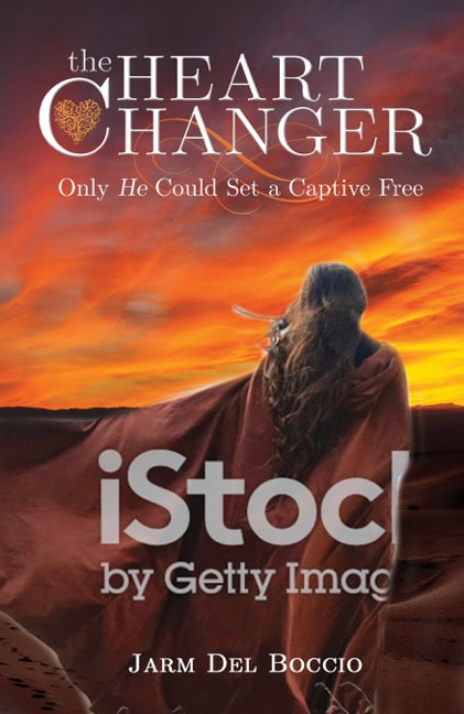
So I sent her an image from the Internet with my vision for Miriam, my main character.
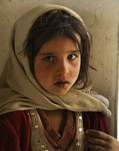
Image from Rhian Non's Pinterest account
This was my MC - a servant girl, scruffy, but cute, with a bit of sass. Even though I sent her this photo, I made it clear I did not want her facing outward. Readers love to imagine their own MC, so I chose to leave it up to them.
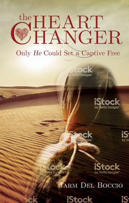
I LOVED the one above, even though it had a ghostly appearance. For some reason, that appealed to me. But, it needed to be filled in, which she did below. The color and pattern on the shawl I was not crazy about, although this was the closest yet!
Maybe because I am right handed, or maybe it’s my visual artistic bent— I preferred Miriam on the right side of the cover instead of the left. And burgundy would suit her shawl instead of red. She also needed to bring the image down or disguise the colored sleeve.
One more go!
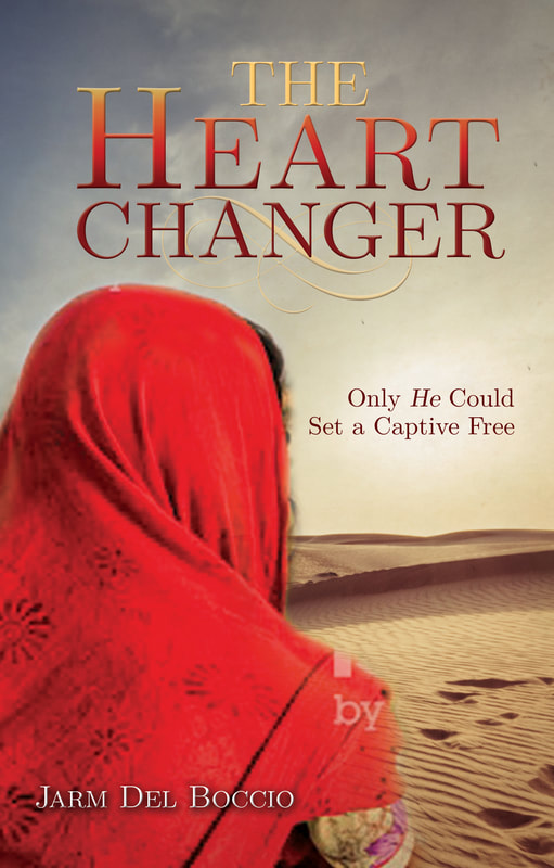
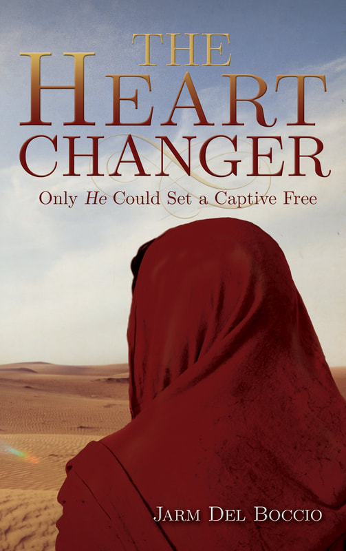
Ta Da! Here is the final image. Lonely, deserted, isolated. Just like my MC. True to her character, and true to the story. And it’s rather ironic that I am becoming a minimalist in every way — including my artistic choices! What think ye? What you imagined?
To tell you the truth, you’ll need to read the story before making the finals decision. In that case, here is the Amazon pre-order LINK!
Thanks for stopping by to watch the evolution of my book cover! And being so good about reading the story before scrolling down to the end. You were good, weren’t you?? I’d love to hear your thoughts about the process. Did anything surprise you?
11 Comments
Laura M
2/6/2019 12:18:18 pm
Love the cover and interesting to read about the work and progression to the final product! 2/6/2019 12:53:11 pm
Thanks for stopping by to read my post and comment, Laura! I found it equally fascinating, which is why I wanted to blog about it. 2/7/2019 07:21:05 am
Isn’t it fascinating? I certainly learned a ton as we moved forward! Thanks for commenting, Laura.
Brian
2/6/2019 11:48:57 pm
Thanks for the behind the scenes description. It fascinated me how this stuff gets put together. I agree with you that girls legs shouldn’t be shown and the blurry one was not a winner. 2/7/2019 07:19:53 am
Sure, Brian. . .glad you enjoyed the journey! Thanks for stopping by. 2/7/2019 11:26:00 am
Thanks for your input, Tina! I had suggested a slight profile, but it wasn’t possible. But, since I am using my daughter as a model in my book trailer, you will see her face!☺️ 2/7/2019 08:26:42 am
What a fabulous cover! Thanks for sharing all of them and your thoughts. Each one is beautiful. Your reactions good and not so good were my favorite part. Now I can't wait for April 26th - 11 weeks feels way too long.
kelly
2/7/2019 09:00:05 am
As a mom of an insatiable MG reader, (as I double check all her choices of books...) if I had seen anyone of those first four covers, I would have said, "Nope!". They looked too sensual, and we stay clear of that! I'll be honest, as a VERY conservative media user, we generally stay clear of MG books that have photo's instead of art. However, I don't always judge a book by it's cover.... 2/7/2019 01:07:45 pm
Good observations, Kelly! I’d love your daughter’s opinion. And you’d make a great book launch team participant! Think about it.☺️ Your comment will be posted after it is approved.
Leave a Reply. |
Good News!My MG Biblical fiction "The Heart Changer" debuted in 2019 with Ambassador International. Categories
All
|
 RSS Feed